Removing friction from a national visa journey
An independent, constructive UX review and conceptual redesign of a national visa application platform, focused on mobile usability, system clarity and trust. Heuristic evaluation, journey mapping and personas lead to a redesigned mobile experience. The platform is a genuine achievement in digital government; this study looks at where it could go further.
Problem scope
High-stakes, low-tolerance. Every defect costs a traveller time, money or a trip.
Digital visa applications are high-stakes. Users apply under time pressure, with money and travel dates on the line. Any interruption or ambiguity has an outsized impact on trust and completion.
Mobile teardown — the landing page
Three blockers appear before the user has done anything at all. On mobile they stack on top of each other, and none of them can be dismissed cleanly.
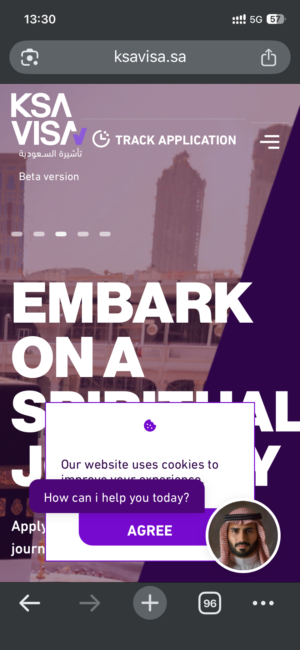
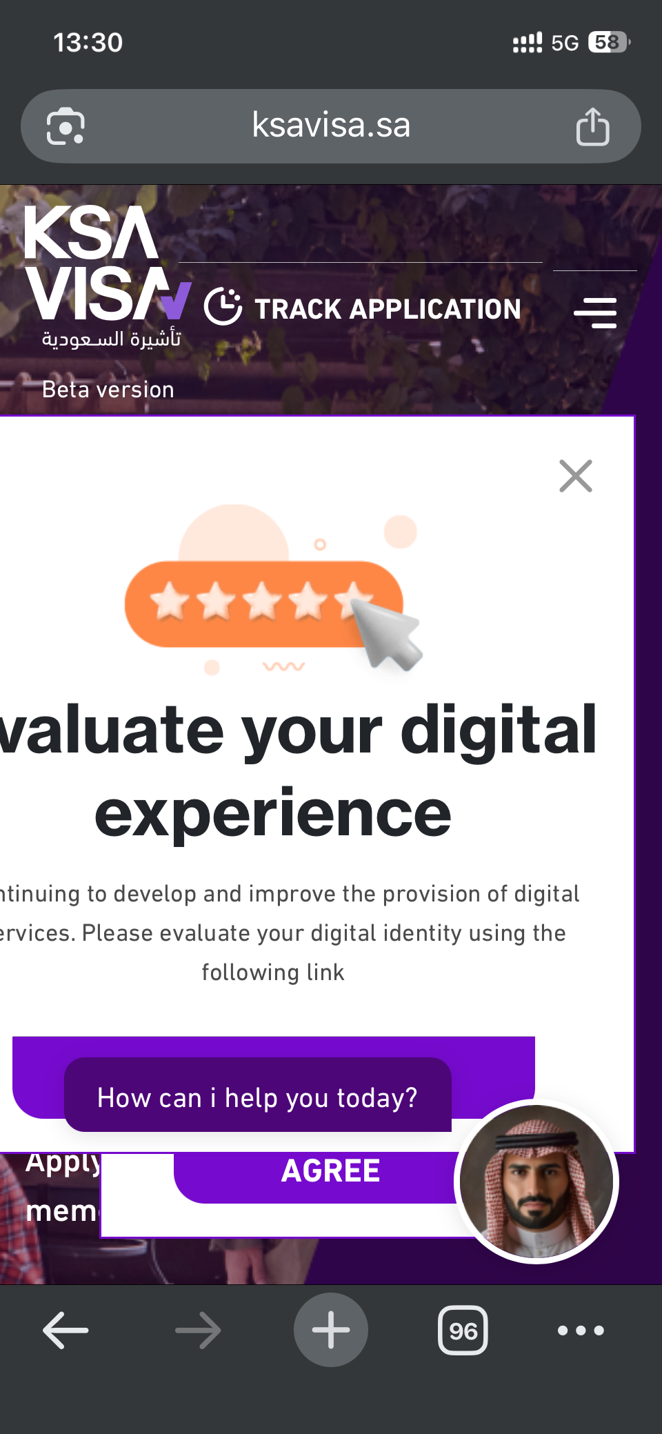
A request to rate the digital experience fires on arrival, before the platform has been used. It costs attention and yields data that means nothing.
The assistant overlays the page and offers no dismiss or minimise. On a small screen it covers the primary action, so the process cannot continue.
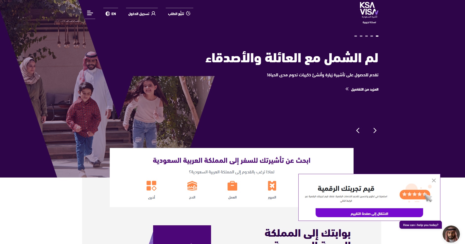
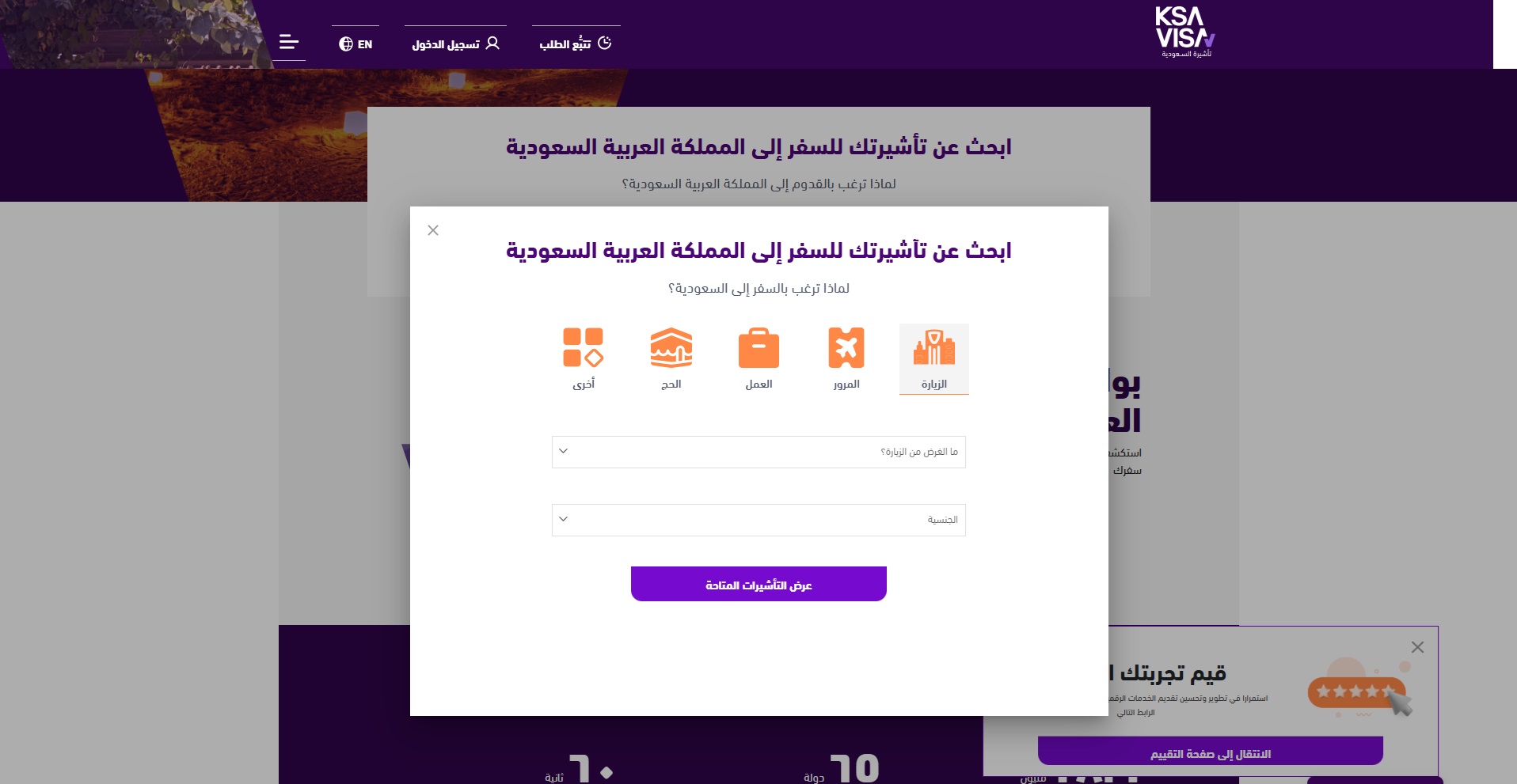
Overlapping panels, clipped forms and hidden buttons. Visibility and interaction both degrade at mobile widths.
Evaluation framework
Before auditing anything, I set the criteria a visa application system has to meet, and the failure modes that break it. Everything after this is measured against these two lists.
How to succeed
How to fail
Personas
Three applicants from different countries, each hitting a different wall in the same system.
User journeys
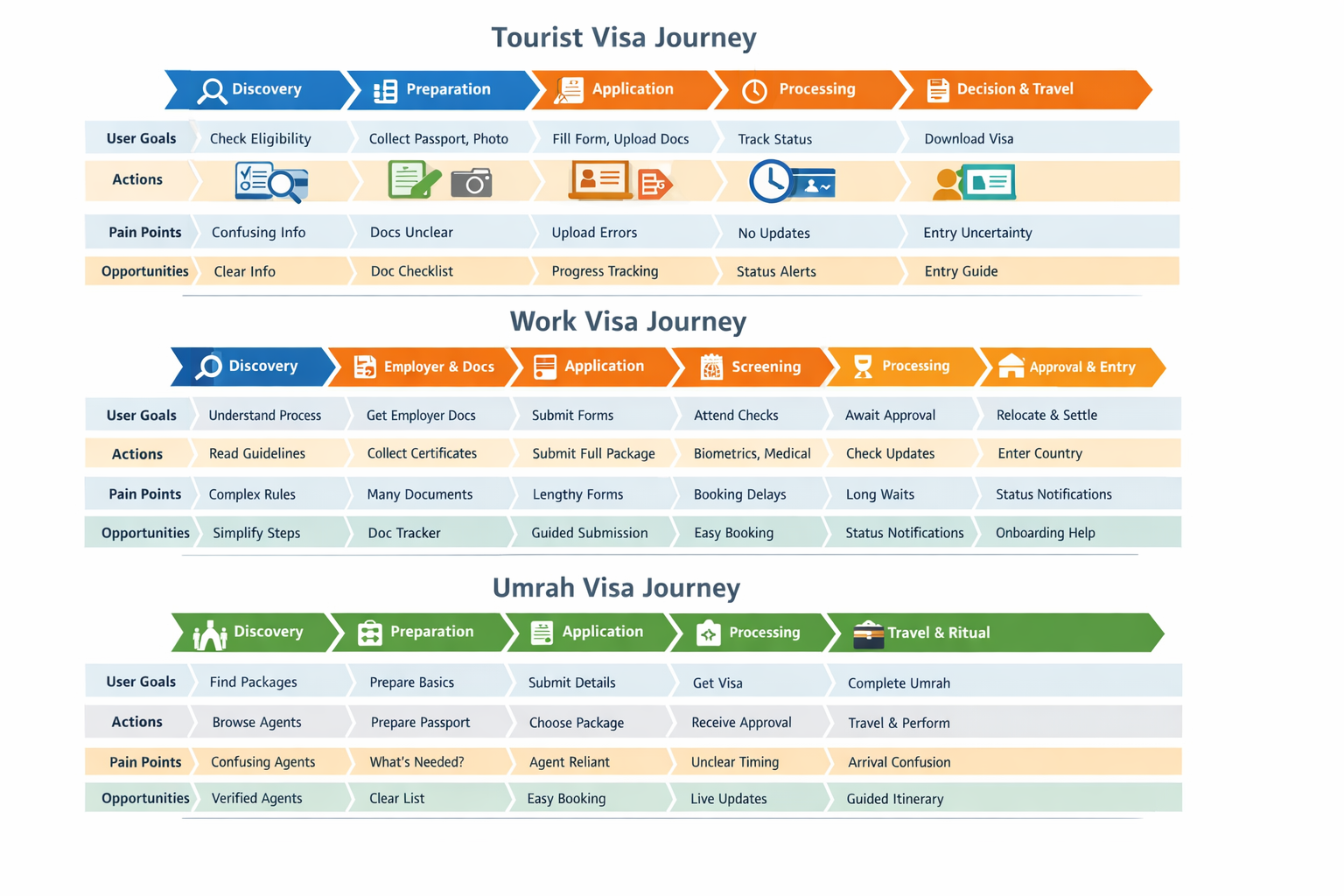
Three visa types mapped stage by stage: goals, actions, pain points and the opportunity at each step. The pain clusters in the same two places every time: document preparation and waiting without status.
Heuristic evaluation
All ten of Nielsen's heuristics, each with the observed issue, a severity, and a recommendation an engineering team can act on. Two findings are Critical or High and would be first in any remediation plan.
Conceptual redesign
A mobile-first rebuild of the whole application path, built against the findings above. Nothing blocks the primary action. Eligibility and price are answered before any form, uploads fail informatively, and payment cannot duplicate. Status is a screen, not an email you hope arrives.
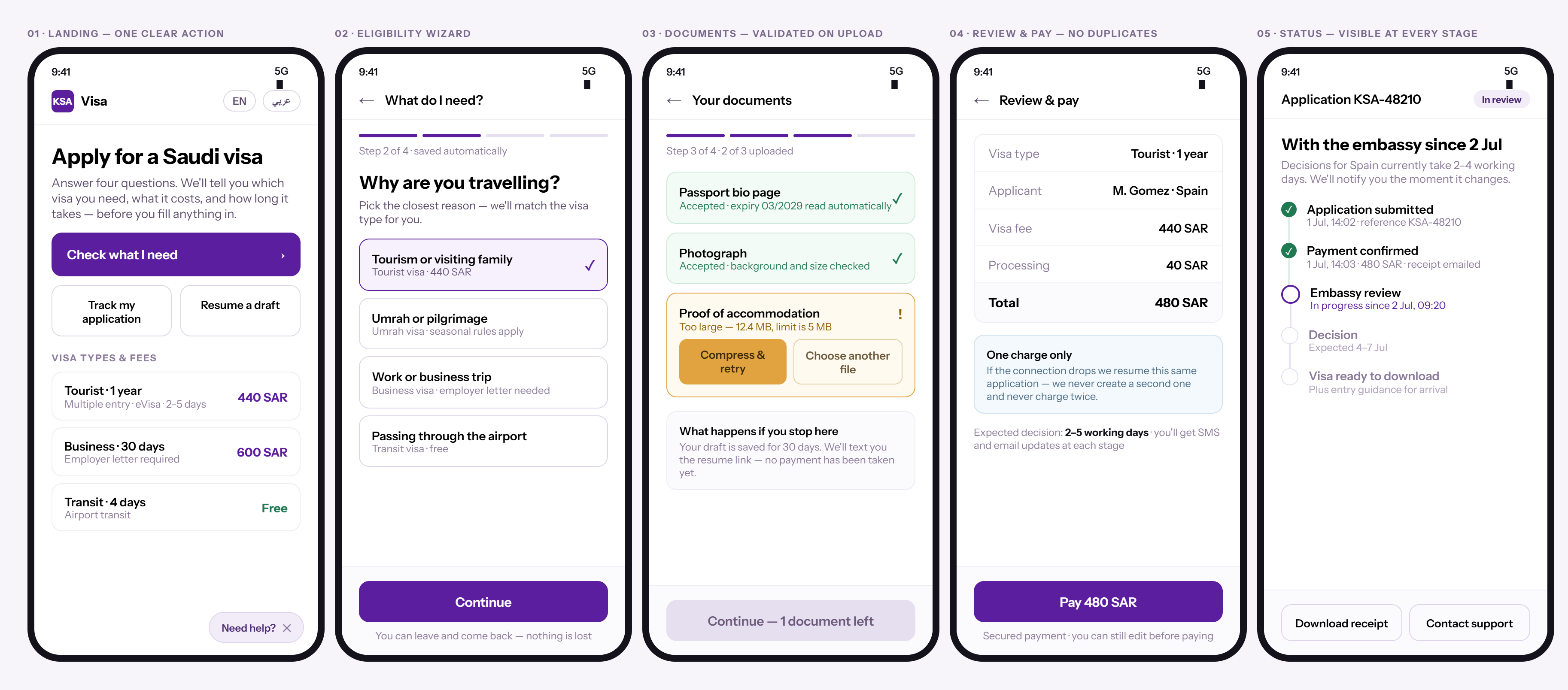
The landing screen opens with a single primary action and two secondary paths: track, or resume a draft. No survey, no consent wall over the CTA. Help is a dismissible pill in the corner with a visible close control, so it can never trap the user.
A four-question wizard in plain language: "Why are you travelling?" instead of visa-code taxonomy, with the matched visa type and fee shown on each option. Fees and durations are on the landing screen too, so the two questions applicants arrive with are answered first.
Each document validates on upload and states what was read: "expiry 03/2029 read automatically". Failures name the cause and the limit ("12.4 MB, limit is 5 MB") and offer two recovery actions instead of "something went wrong". Progress is 2 of 3, not a spinner.
An itemised total before the commit, an explicit promise that a dropped connection resumes the same application, not a second one, and the expected decision window stated before payment. Drafts auto-save for 30 days with an SMS resume link, so login friction never costs the work.
The pain point every persona shares, silence after submission, becomes a tracked timeline: reference ID, timestamped stages, who holds the application now ("with the embassy since 2 Jul"), a realistic decision window based on nationality, and what happens after approval. Support, receipt and step-specific help are one tap away on the same screen.
What I'd validate next
Run the tourist, work and Umrah journeys with real applicants from those countries, on their own phones and connections.
Drop-off by step, upload failure rate and duplicate-payment incidence would turn a heuristic severity into a business case.
The Arabic version needs its own audit. Reading right to left, the mirrored layouts crowded and overlapped differently.